In my article on Aug 5, I had said that we are likely to see a major decline in house prices leading to a large number of mortgage defaults. By now, house prices have started to drop with the Case-Shiller Index (CSI) showing declines for three months now in various western metros. The national CSI and the purchase only FHFA indices have also shown declines for two months now.
A growing number of economists are now forecasting house price declines of varying levels. For example, Mark Zandi of Moody’s is calling for a 10% national house price decline with no recession and a 20% decline with a “typical” recession. Given that a recession is very likely, a national decline of 20% is quite large indeed and yet there has been little discussion to date of its implication for mortgage defaults with The Economist being among the few raising this topic in their recent cover story. Nevertheless, investors are now reflecting their concern in prices of securities exposed to mortgage credit risk.
In this article, my purpose is to form a reasonable estimate of the level of mortgage defaults resulting from the above house price decline. There are two main points I build on for this purpose.
First, compared to 2007, house prices are likely to decline across a bigger population across a larger geographic footprint and this decline is likely to be comparable in magnitude to what was experienced in only a few regions in 2007. Unlike in 2007, when it was high house prices that made homes unaffordable, today it is both high house prices and high mortgage rates. The fact that mortgage rates, which are national, were first very low during the pandemic and since then have now shot up to the highest level in 20 years has both contributed to the geographically expansive run-up in house prices and is likely to make the decline similarly so.
Second, a number of economists and commentators, including those calling for steep declines in house prices, have, nevertheless, argued that things are different today because of stronger underwriting and better borrower financial conditions and that, therefore, there is little likelihood of mortgage defaults being anything similar to the post-2007 experience. The post-2007 mortgage default data, however, does not support such a conclusion. Rather, the evidence is that the biggest driver of mortgage defaults is falling house prices and the negative equity that results from it and that this, by far, outweighs the contribution of borrower or loan characteristics such as FICO scores or subprime status.
My analysis makes use of these points to argue that the projected decline in house prices is likely to result in mortgage defaults that are 60% – 85% of what was experienced after 2007. To this end, I make use of published data from Fannie Mae and Freddie Mac. I also consider today’s FHA portfolio and its comparability to the 2007 subprime portfolio along with the fact that Alt-A loans (risk between prime and subprime with usually low/no documentation), which were a big part of the 2007 portfolio, are mostly absent today.
BORROWER DEFAULT DECISION AND VULNERABILITY TO DEFAULT
As I previously discussed, borrowers typically default when they have negative equity and, in addition, experience a financial shock (such as loss of job) leading them to be unable to meet their mortgage payments. Negative equity is a necessary condition and that, along with a financial shock, causes some fraction of borrowers so affected to default.
Even though it is sometimes argued that borrowers are in a comfortable position today to withstand declines in house prices because of the large equity cushion they have built up, the fact is that not all borrowers have such a cushion. The borrowers most vulnerable to mortgage default are those who purchased a house around the peak of the housing market – for example, Freddie Mac’s 2012 annual report (p.132, Table 39) indicates that, in 2012, 61% of credit losses that year were produced by the 2007 and 2006 vintages and 87% by the 2005-2008 vintages; Fannie Mae results (p. 107, Table 16) are similar and also show (p.16) that 2007 and 2006 vintages have the highest cumulative default rates of over 16% and 14% respectively, followed by 2005 and 2008 with 9% and 6% respectively.
Since house prices appear to have peaked in mid-2022, this would put those who bought a home in 2021 and 2022 as well as those who plan to buy a home in 2023 most at risk of default. In addition, a smaller fraction of those who took on additional mortgage debt, using the equity in their home, (e.g. cash out refinance, home equity loan) are also vulnerable to default.
CURRENT HOUSE PRICE EXPERIENCE AS COMPARED TO 2007
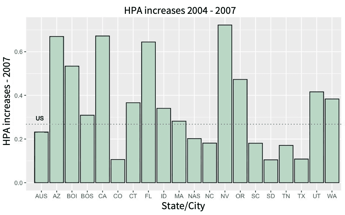
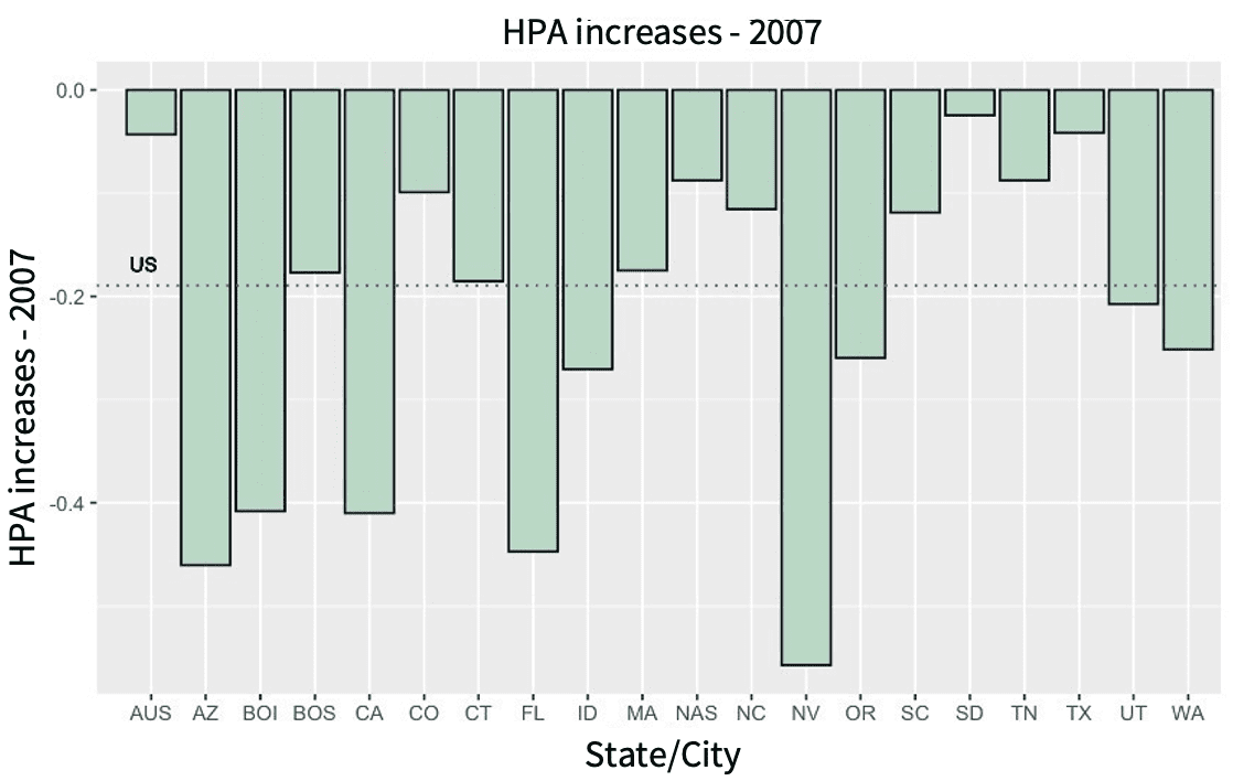
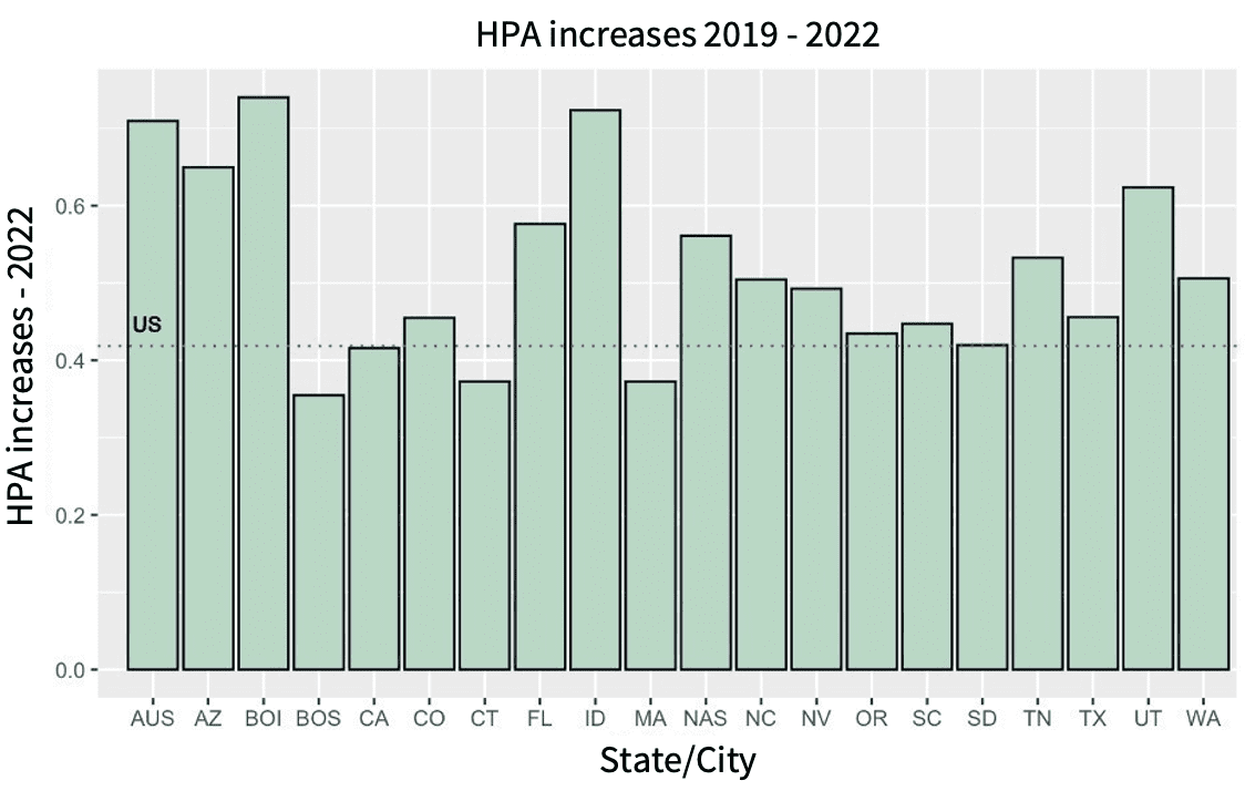
(Figures 1-4 and Tables 1-2 below use the FHFA All Transactions index since it covers a broader geographic area than the CSI. The CSI is a better index since it excludes refinance transactions and includes jumbo loans, but it covers only 20 cities. The two indices, however, broadly agree on the direction of house prices with the FHFA showing smaller increases and decreases than the CSI. The figures show house price data for a number of states as well as for four cities – Austin (AUS), Boise (BOI), Boston (BOS), Nashville (NAS). For each state or city, the house price appreciation (HPA) increases shown are for the 3 years prior to the house price peak and the HPA decrease is from the house price peak to the house price bottom).
Figure 1 shows that the biggest house price increases prior to the 2007 peak were in CA, FL, AZ and NV. Overall, the increases were dominated by a few states and there is a lot of variation across the HPA increases across the various states/cities. The US national increase (horizontal dotted line) is 27% (37% if using CSI).
Figure 1
Source: FHFA All Transactions index
Figure 2 shows that the post-2007 decline is also dominated by the same states that had the biggest run-ups, with a national average decline of 19% (27% if using CSI).
Figure 2
Source: FHFA All Transactions index
Figure 3 shows that today’s HPA increases are much broader encompassing not only the states that saw excessive HPA’s in 2007 but also states such as TX, CO, NC, SC, SD etc. As a result, there is much less variation in HPA across the states. The US national HPA increase is now 42% driven by the broad-based nature of the house price increases.
Figure 3
Source: FHFA All Transactions index
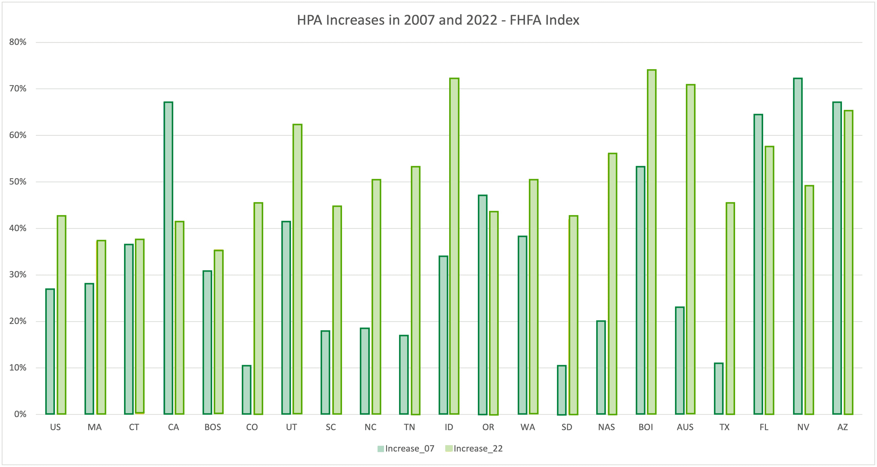
Figure 4 provides another look by placing today’s growth rate next to the 2007 growth rate for each of the states/cities to contrast how much higher the HPA increase for some states has been recently relative to their 2007 experience.
The implication is that we are likely to see more house price declines all around going forward made up of – similar declines in the states that declined the most post-2007 (with perhaps lower declines in CA and NV) and much bigger declines, relative to 2007, in many of the other states. This means that, relative to 2007, borrowers across a broader cross-section of states, i.e. a larger population of borrowers, are likely to be impacted by falling house prices. This, in turn, implies that, of the borrowers who took out mortgages to purchase homes recently, a larger fraction are likely to find themselves with significant negative equity.
Figure 4
Source: FHFA All Transactions index
It can be argued that part of the high HPA increases today are due to inflation though to the extent that incomes don’t grow with inflation, which has been the case, houses are correspondingly less affordable. Part of the increase could also be from increased demand for houses due to remote work. While both these explanations may have some truth, the HPA increases since 2020 are very excessive and they come on top of above-average increases for several years before 2020 leaving these explanations unlikely to account for more than a small fraction of the increase.
Another argument that has been advanced is that there is a shortage of homes and that this will limit any drop in house prices. However, recent data is not consistent with a shortage, rather it shows that new home sales have dropped steeply in recent months while the inventory of new homes has risen sharply and, as of Sept, equates to a 9.2 months supply which is the highest since 2010. Existing home sales have also dropped steeply since the beginning of 2022 (around 27%) and are starting to approach the lows seen after 2007. This is not surprising when one recognizes that homes have become much less affordable, both due to high prices and also due to sharply rising mortgage rates. The Housing Affordability Index has fallen to the level of 2007 while the Atlanta Fed’s Home Ownership Affordability Monitor has fallen even lower.
In fact, a key difference between today and 2007 is that, in 2007, housing became unaffordable because house prices grew very fast in some parts of the country while mortgage rates did not fluctuate very much during 2003-2007. Today, however, housing has become unaffordable not only because house prices have grown very fast but also because mortgage rates have risen sharply to levels not seen in the last 20 years . It is important to note that part of the reason why house prices grew so fast today is because mortgage rates fell to a very low level, driven by the policies of the Federal Reserve, and this made homes artificially very affordable leading to a huge increase in the demand for them which then drove up their prices. Since low mortgage rates were a national phenomenon, this is likely why we are seeing such a geographically broad-based increase in house prices. For the same reason, as mortgage rates have shot up by so much recently, we are likely to see a similar decline in house prices in the near future. Given the twin factors of high house prices and high mortgage rates, this decline is likely to be comparable in magnitude to what was experienced in only a few regions in 2007.
House prices are likely to decline more broadly than and as deeply as 2007 due to twin factors – high house prices and high interest rates
TIME TAKEN FOR HOUSE PRICES TO BOTTOM OUT
House price declines, when they occur, do so for a long time. Tables 1 and 2 show the house prices experience following the 1990 and 2007 recessions respectively with the time to the bottom in the right-hand column. The experience of both recessions shows that it typically takes 5-6 years for house prices to bottom out whenever they have a significant decline. This aspect of house price declines is devastating to borrowers who have negative equity since they cannot hope for a quick rebound in their house price that would make their equity position positive and, thereby, allow them to sell the house in the event they suffer a financial shock.
Table 1 – 1990 Recession House Prices

Source: FHFA All Transactions index
Table 2 – 2007 Recession House Prices
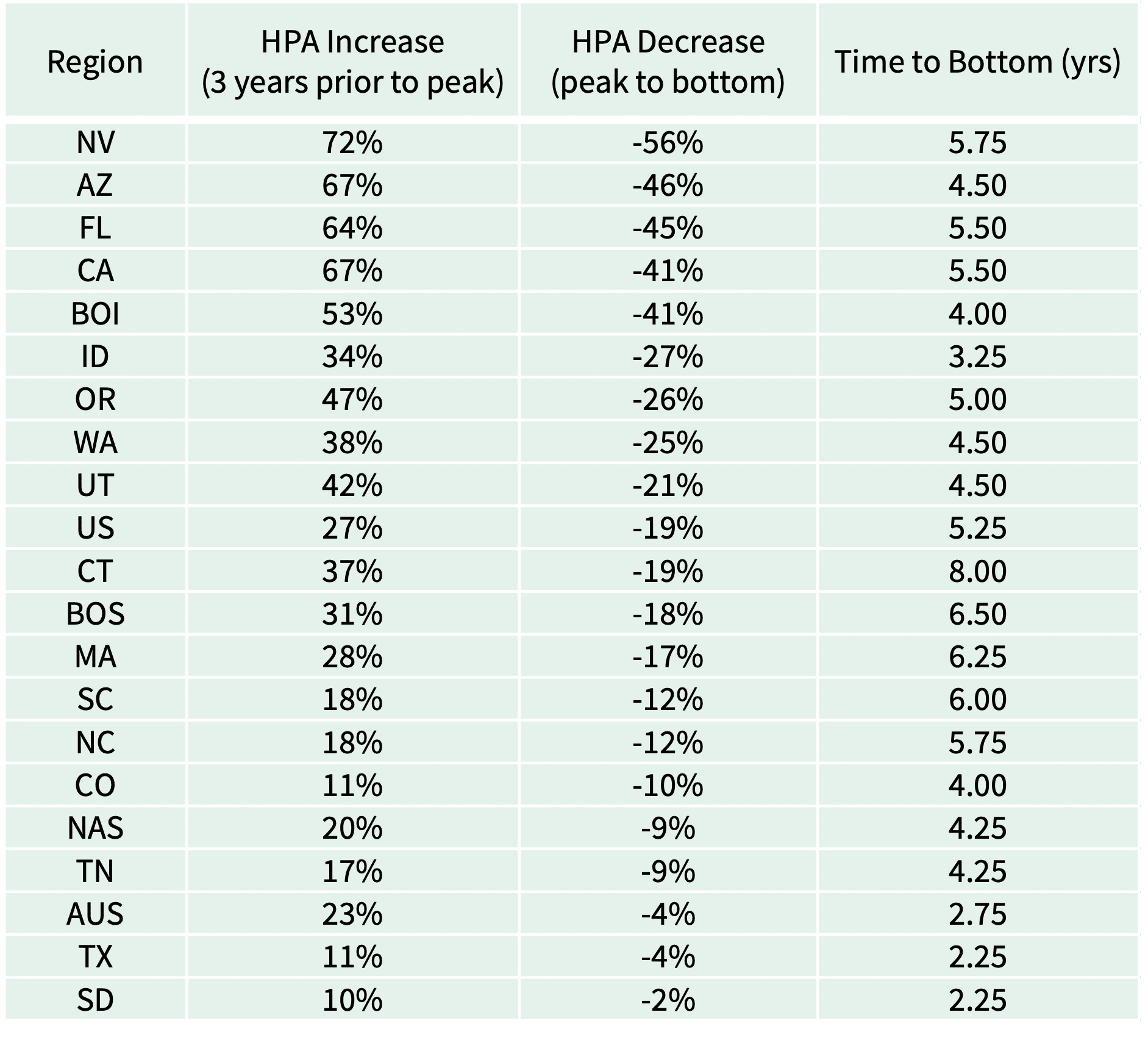
Source: FHFA All Transactions index
CURRENT CREDIT QUALITY
As noted earlier, many economists hold that, even if house prices decline very significantly, it is unlikely that this would trigger many defaults since lending standards today are much tighter with none of the excesses (e.g. subprime, Alt-A, interest only loans) that were seen in 2007. Also, consumers are in better financial condition with lower debt levels and this is also reflected in their higher FICO scores today.
While this is true to some extent, for example, there are very few low/no document (Alt-A) and interest only loans originated today, the picture of current credit quality and its impact on potential mortgage default losses is more complex.
FICO SCORES
The average FICO score in 2007 was 689 while in April 2021 it was 716, i.e. it increased 27 points.
So is borrower credit quality today that much better than it was in 2007? A 2019 Bloomberg article had argued that FICO scores were inflated citing work by Moody’s, Goldman Sachs and the Fed. First of all, as noted by FICO in response to this article, FICO scores are not fixed estimates of risk and “..The FICO® Score is designed to rank-order the likelihood that a borrower will repay their loan(s)..” i.e. it is a relative risk ranking tool. Per FICO, the probability of default (or, alternatively, the repayment odds used by FICO) for a given FICO score can change over time due to changes in either macroeconomic conditions (e.g. unemployment rates, house price changes) or in underwriting practices. In FICO’s own comparison of scores for bankcard originations between 2012-2014 and 2016-2018, scores in the former period have the same repayment odds as scores that are about 10 points higher in the latter period. Note that this 10-point difference is for FICO scores that are just 4 years apart and both time periods occurred when the economy had started gaining some momentum after the 2007 recession. This suggests that FICO scores, that map to the same repayment odds, may have grown even more between 2007 and 2021, on account of the bigger improvement in economic conditions since 2007. FICO has argued that the shift over time in how FICO scores map to repayment odds is not FICO score inflation but the net effect is still that the large increase in FICO scores since 2007 may be mostly driven by the economy. This means that a 700 FICO today is more risky than a 700 FICO in 2007 and that it may have the same credit risk as, say, a 680 FICO in 2007.
Secondly, average FICO scores went up 8 points in the first year of the pandemic – from 708 to 716 – which is by far the biggest 1-year increase in FICO since 2007. As noted by FICO, this was not only due to government stimulus payments, forbearance programs and reduced spending leading to fewer missed payments and reduced debt levels but also because, per the CARES Act, FICO scores did not reflect a negative impact for consumers who sought forbearance. The effect of stimulus payments, forbearance and reduced spending has been wearing off with the reopening of the economy as well as with rising inflation, which suggests that this large jump in FICO may be transitory. In fact, during the following year (2021-2022), which was marked by rising inflation that strained consumers’ budgets to such an extent that it resulted in historically low levels of consumer sentiment as well as in a low saving rate approaching that of 2005-2007, FICO scores have still managed to stay flat.
It is also worth noting that, even when the average FICO gained an exceptional 8 points during 2020-2021, 37% of borrowers saw a reduction in their FICO scores with 17% (1 in 6 borrowers) seeing a reduction of 20 or more points. This suggests that such variability in FICO scores may have been even more common in other years which saw less average increase in FICO and the variability may have been considerably higher in 2021. Since defaults are more common among borrowers in the lower tail of a credit distribution, changes in the tail are more important for defaults than changes in the average as noted in this BIS study.
In summary, it is unclear if credit quality has meaningfully improved since 2007 and the 27-point increase in FICO scores from 2007 to 2021 may not necessarily imply lower probabilities of default today particularly if economic conditions deteriorate significantly.
STUDIES SHOW CURRENT LTV MATTERS THE MOST FOR DEFAULT
Most narratives of the 2007 housing downturn and its aftermath have blamed it primarily on subprime lending and on the issuance of exotic mortgage loans with features like no/low doc, interest only and zero down payment. It is common to hear the downturn referred to in the media as the subprime crisis. However, recent studies by economists have shown that the 2007 downturn was not primarily a subprime event but was mainly due to prime borrowers defaulting because falling house prices had caused them to have negative equity making them vulnerable to financial shocks. These studies have also shown that, by far, the biggest contributor to the defaults for both prime and subprime loans was current loan to value (CLTV) i.e. the original LTV adjusted for declines in house prices and amortization of the loan.
Adelino, Schoar and Severino (2016) show that middle and high-income borrowers were the majority of borrowers defaulting, in dollars, during the 2007 downturn. Also, the share of defaults from borrowers with high credit scores (prime) actually increased during the downturn while the share of subprime borrowers dropped. In particular, the share of defaults from prime borrowers was concentrated in the 50% of zip codes that saw the steepest run-up in house prices pre-2007 and a sharp drop thereafter.
Overall, “..house price increases and drops played a central role…in subsequent defaults..” which is illustrated by Fig 5 (p.1655, Fig 7). The authors also show that zip codes with high house price growth tended to have a higher proportion of sales of homes that also sold in the prior 12 months i.e. were flipped (Fig 8), which could be a feature of the current house price run-up as well, going by various media stories.
Figure 5
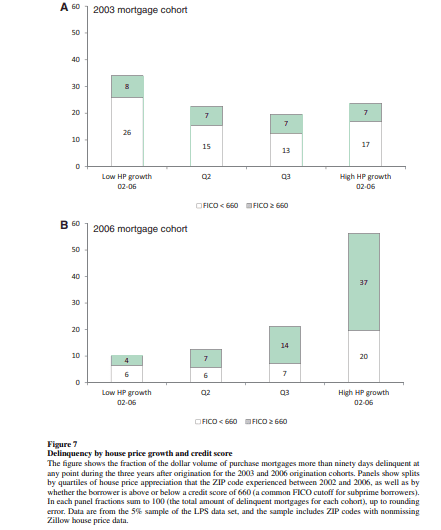
Source: Adelino, Schoar and Severino (2016)
Ferreira and Gyourko (2015) show that the current loan to value (CLTV) of a loan almost entirely explains the level of defaults of prime borrowers and, interestingly, about three quarters of the defaults of subprime borrowers. They show that the combined effect of CLTV and a proxy for income shock explains all or most of the behavior of prime and subprime borrowers supporting not only the theory that mortgage default is driven by negative equity along with a financial shock but also undercutting the characterization of the 2007 mortgage default crisis as being driven by subprime lending.
Palmer (2015) focuses only on subprime borrowers and shows that at least 60% of differences in their default rates can be explained by the differences in their exposure to house price declines. His counterfactual simulations show that had subprime borrowers who took out loans in 2003 experienced house price paths that were actually experienced by 2006
Figure 6
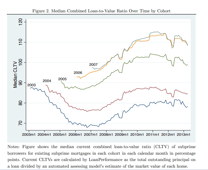
Source: Palmer (2015)
borrowers, their default rates would have gone up from 4.2% to 8.5%, accounting for a majority of the differences in default rates between the two cohorts (4.2% vs 12%). Fig 6 shows the median CLTV over time of the various cohorts reflecting their house price experiences and further reinforces the point that, even for subprime loans, CLTV is the most important determinant of defaults.
To sum up, in a significant housing downturn, current LTV (i.e. original LTV plus the impact of house prices) is a far more important determinant of default behavior than borrower credit characteristics such as FICO scores.
ORIGINAL LTVs TODAY
As noted earlier, the borrowers most vulnerable to default are those who bought a home at the peak. Given the importance of CLTV and since CLTV is determined in part by original LTV (OLTV), it is useful to see how the OLTVs of mortgages taken out to purchase homes today compares with that of the 2007 period using data provided by Fannie Mae and Freddie Mac on the OLTVs of loans acquired by them. Loans acquired by the GSEs (Government Sponsored Enterprises i.e. Fannie Mae and Freddie Mac) in any given year include both loans used to buy homes (purchase loans) as well as loans used to refinance existing loans (refinance loans) and the data provided by the GSEs does not break out the OLTVs by these two categories. However, purchase loans tend to have higher OLTVs and both GSEs provide the percentage of purchase loans in a given year.
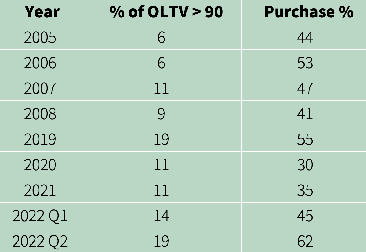
Table 3 shows the OLTVs of mortgages acquired by Fannie Mae. The middle column shows the percentage of loans with OLTV greater than 90. These are a mix of mostly loans with 95 OLTV with some higher OLTVs. The right-hand column is the percentage of purchase loans.
Table 3
Fannie Mae original LTVs
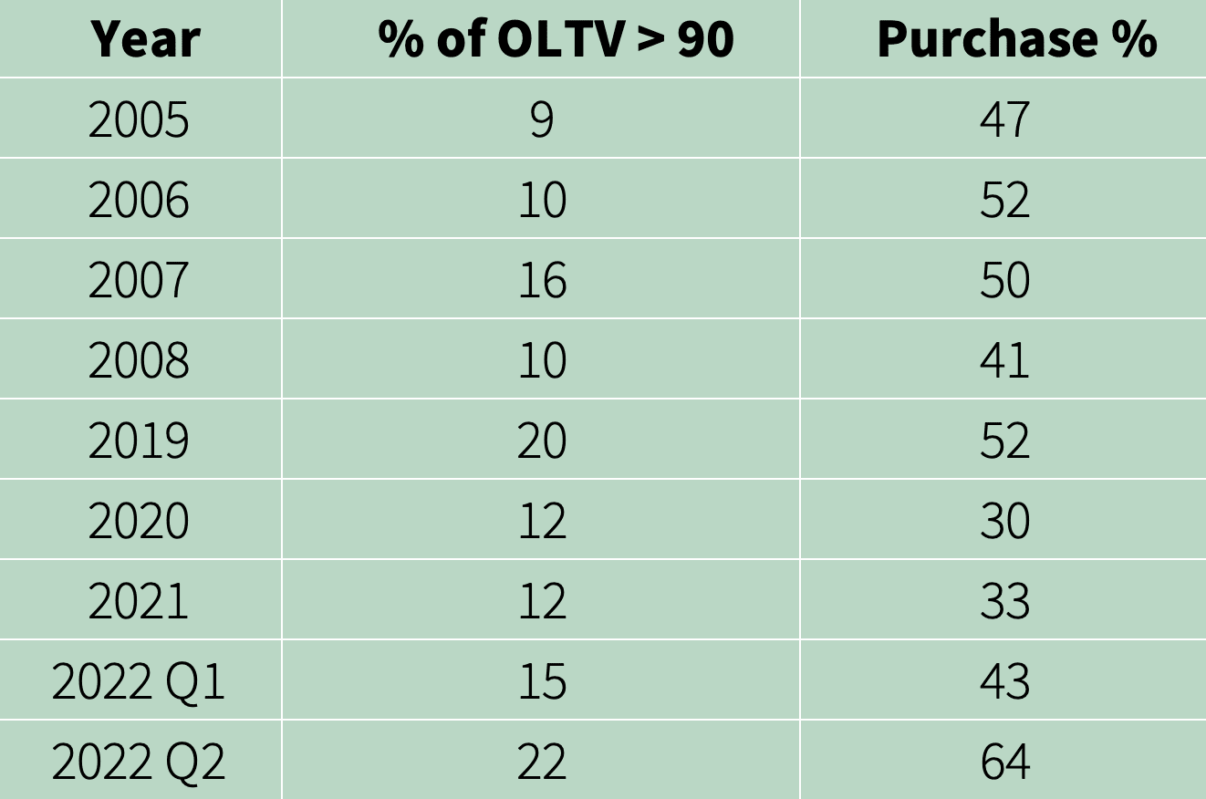
Source: Fannie Mae annual reports
The percentage of loans with OLTV greater than 90 is generally higher in recent years as compared to 2005-2008. It drops somewhat during 2020 and 2021 as these were years during which a majority of originated mortgages were refinanced (as shown by the lower purchase % in the right-hand column) but, during 2019 and 2022, the numbers are significantly higher.
While this data covers all mortgage originations acquired by Fannie Mae, it is very suggestive that purchase loans in recent years have higher OLTVs than purchase loans from 2005-2008.
Similarly, Table 4 shows the OLTVs of mortgages purchased by Freddie Mac. The conclusion from it is even stronger that recent originations have higher OLTVs with a likewise stronger conclusion about purchase loans.
Since the GSE data used in Tables 3 and 4 does not break out the OLTV’s for purchase loans, loan level data made publicly available by Freddie Mac can be used to compare OLTVs across 2007 and 2021 just for purchase loans.
Table 4
Freddie Mac original LTVs
Source: Freddie Mac annual reports
The results using Freddie Mac loan-level data are even stronger i.e. the percentages of OLTV greater than or equal to 95 for purchase loans in 2007 and 2021 are 18% and 28% respectively.
These results indicate that there are more high OLTVs today among purchase loans than around 2007, implying that a house price decline similar to 2007 would result in higher CLTVs for borrowers who purchased homes recently.
HIGHER VOLUME OF PURCHASE LOANS TODAY
As noted earlier, the borrowers most vulnerable to mortgage default are those who purchased a house around the peak of the housing market. Accordingly, it is useful to see how the volume of recent purchase loans compares with that around 2007. Using information from Urban Institute’s monthly charts on origination volume (Fig 7) and percent refi (p.8, p.9), one can see that the
Figure 7
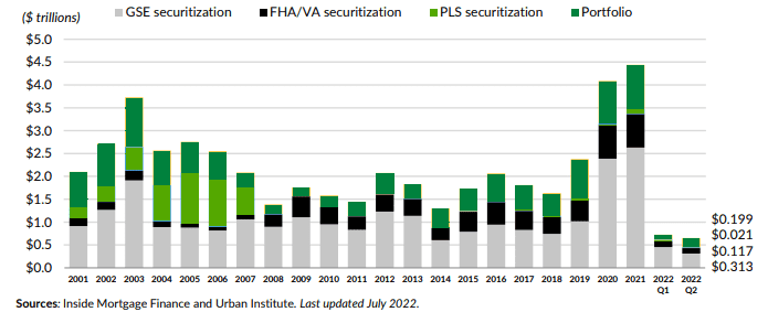
volume of purchase loans acquired by the GSEs during 2020-2022 is considerably higher than that during 2005-2007. It also appears to be that the total volume of purchase loans originated during 2020-2022 is higher than that during 2005-2007.
FHA AND SUBPRIME LOANS
As mentioned earlier, the 2007 downturn is often referred to as the subprime crisis and it is sometimes argued that a similar crisis cannot happen today since subprime loans are not being originated today. In this section, I will discuss the FHA portfolio and its similarity to a subprime portfolio.
As mentioned in the introduction to the FHA’s 2009 annual report to Congress (p.1), “…FHA was largely shut-out of the mortgage market during the boom years of 2003-2007..”. This was because about 50% – 60% of subprime private label securitizations were not eligible for FHA insurance (chart 4) primarily because they were either 100 LTV loans or were no/low doc loans (this suggests that many of the ineligible loans were probably Alt-A loans because some of these characteristics were more common for Alt-A). As a result, the market share of FHA dropped steeply during 2003-2007 which was the same time when the market for subprime loans grew rapidly (chart 3, Urban Institute p.8).
Those purchase loans that did get insured by FHA during 2003-2007 had median FICO scores around 630-640 (chart 2), which was slightly lower than those of private label subprime and, further, around 40% of such FHA loans during 2005-2007 had FICO < 620 (Table 2b). Their LTVs were similar to private-label subprime (chart 1). FHA loans during 2003-2007, therefore, had comparable credit quality to that of private-label subprime.
How do FHA purchase loans today compare to those from 2003-2007? FHA purchase loans from both periods have similar LTVs – average LTVs for 2007 and 2021 are 95.99 and 95.54 respectively (Table D-6). The average FICO of purchase loans for 2007 and 2021 are 634 and 673 respectively (Table D-7). As discussed earlier, these FICO scores show an upward drift but only part, if any, of this increase in FICO may count towards lowered cred it risk in terms of default probabilities. Very strikingly, the debt to income (DTI) ratio of FHA purchase loans has trended upward with the percentage of DTI >= 50 increasing from 9.5% in 2007 to 23.7% in 2021(Table D-9). Given all this, FHA purchase loans today have probably slightly lower to similar credit risk as those from 2003-2007.
The conclusion, therefore, is that FHA loans, which are a big part of recent mortgage originations, have credit risk similar to or, at best, slightly lower than that of private label subprime loans issued duringthe 2003-2007 period. Put differently, in light of there being little subprime private label securitization today, FHA loans are the subprime loans of today and it is incorrect to say that there are no subprime loans being originated today.
POST-2007 CREDIT LOSS EXPERIENCE OF THE GSEs
As is well known, Fannie Mae and Freddie Mac were placed into conservatorship in 2008 by the US Government given the prospect of their sustaining credit losses far in excess of their capital. Over the following years, as both GSEs realized large losses, they reported not just total losses but also the fraction of losses attributable to a sub-population that included only their higher-risk loans.
Fannie Mae has reported losses for a sub-population that includes only Alt-A loans, subprime loans, interest-only (IO) loans, loans with original loan-to-value ratio greater than 90%, and loans with FICO credit scores less than 620. It is important to note that, by including loans with original LTV > 90 in this sub-population, Fannie Mae has grouped together a sizeable chunk of prime loans along with Alt-A, subprime and IO loans. These prime loans, given their high LTVs, contribute disproportionately to the credit risk of the overall portfolio so that the remaining portion of the prime portfolio can be considered low risk. For this reason, I refer to this sub-population as high risk and the remaining population as low risk.
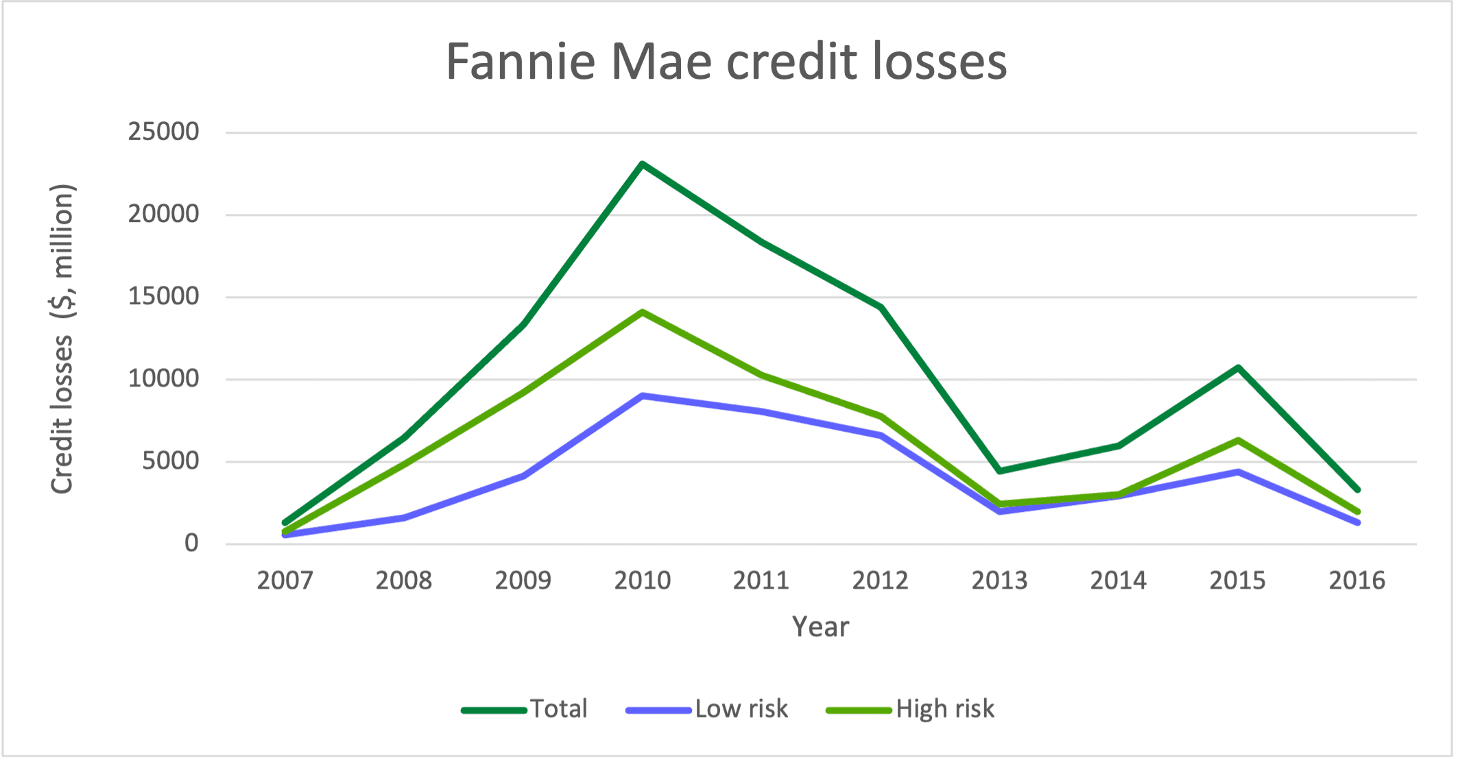
In Fig 8, I have plotted credit losses for each of these sub-populations as well as for the total as provided in Fannie Mae’s annual reports from 2009-2016 (see pp.100-101 Tables 13-14 in the 2009 annual report for an example). It shows that the losses from the high-risk population went up quickly while that of the low-risk population rose more gradually. They both peaked in 2010 and from 2012 onwards the two sets of losses were close to each other.
Over 2007-2016, Fannie Mae had total credit losses of about $101.5 billion while the low-risk portfolio had total losses of about $40.7 billion, implying that the low-risk portion of the losses were about 40%. This is a stunningly high figure as it shows that even a low-risk prime portfolio with LTV capped at 90 can contribute 40% of the total losses over this period. It demonstrates how damaging can be the impact of falling house prices on a low-risk portfolio in terms of credit losses.
Figure 8
Source: Fannie Mae annual reports
While today’s GSE portfolios do not include meaningful volumes of Alt-A, subprime and IO loans, they do include significant volumes of loans with original LTV > 90, as shown in Tables 3 and 4 above. As a result, the credit risk of the low-risk population, which does not include such loans, considerably underestimates the credit risk of today’s GSE (i.e. conforming) loan portfolio i.e. if today’s GSE portfolio was to undergo a 2007 house price scenario, it would produce losses well in excess of 40% of the post-2007 GSE losses.
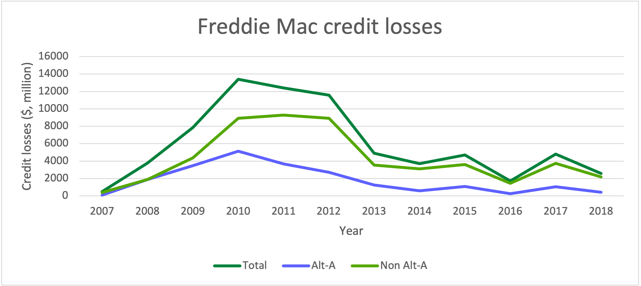
Unlike Fannie Mae, Freddie Mac’s sub-population for which it has reported losses includes only Alt-A loans. Using this, I calculated losses for the non Alt-A portfolio and, in Fig 9, have plotted all three losses based on Freddie Mac’s annual reports from 2008-2018 (see p.161 Table 70 in the 2008 annual report for an example). Alt-A losses rose quickly peaking in 2010 and declined to comparatively low levels from 2014 onwards while non Alt-A losses stayed high till 2012 before dropping sharply.
Over 2007-2018, Freddie Mac’s credit losses totaled $71.9 billion with Alt-A accounting for $21.6 billion or 30%, implying that non Alt-A portion accounted for 70%. This is also a surprisingly high figure since it shows that the vast majority of the GSE losses were due to prime loans and not Alt-A or subprime (Freddie Mac’s portfolio did not have any subprime loans), contrary to most popular narratives. Since today’s GSE portfolios do not include Alt-A or subprime, their credit risk is, therefore, better proxied by the credit risk of the Freddie Mac non Alt-A portfolio while noting that the latter could include some prime IO loans thereby making its credit risk slightly higher.
Figure 9
Source: Freddie Mac annual reports
The credit losses reported by the GSEs are consistent with the studies mentioned earlier which showed that, in a housing downturn, house price declines are by far the biggest drivers of mortgage credit losses causing significant losses even for high-credit quality portfolios and that a majority of post-2007 losses came from prime loans.
In a housing downturn, current LTV (determined by original LTV and house prices) is far more important in driving mortgage defaults than credit attributes such as FICO
PUTTING IT ALL TOGETHER
Based on the prior discussion, I believe we can now make a reasonable effort to predict credit losses for the total mortgage portfolio.
To clarify, the total mortgage portfolio =
Conforming (i.e. GSE) mortgage portfolio + FHA mortgage portfolio + Mortgages held in portfolios of banks and non-banks (mostly jumbo mortgages) + Mortgages securitized
I will first focus on forecasting credit losses for the conforming mortgage portfolio and start with the Freddie Mac non Alt A portfolio as a benchmark proxy for today’s conforming portfolio since today’s conforming portfolio does not include Alt-A. As seen earlier, the non Alt-A portfolio accounted for 70% of Freddie Mac’s credit losses. This means that if today’s conforming portfolio has the same risk as the non Alt-A portfolio and experiences the same house price scenario as in 2007, then its losses are likely to be 70% of the post-2007 losses.
Now let’s consider what could make today’s environment potentially different from 2007 such that it could produce losses different from 70% of the post-2007 losses.
Factors today that would lead to losses less than 70% are, compared to 2007,
- Fewer prime IO loans (including option ARMs)
- Fewer prime ARMs
- Possibly better credit quality – FICO scores, borrower financial condition
Factors that would lead to losses greater than 70% are, compared to 2007, - Higher volume of borrowers who are likely to be in a position of significant negative equity because
-
- large house price declines are likely to be experienced across a broader population
- there is a higher proportion of LTVs that are above 90
- the portfolio has a higher volume of recent purchase loans
Items 1-3 will lead to a lower estimate than 70% while item 4 will lead to a higher estimate than 70%. Given the demonstrated dominance of negative equity over borrower/loan characteristics in impacting post-2007 credit losses (both from the GSEs’ post-2007 financial results and from the studies cited), item 4 is likely to have a bigger impact than items 1-3. At the same time, since there is uncertainty in how big of a decline we are likely to see in house prices across the different regions and in how items 1-3 can affect the impact of such a house price decline on credit losses, my approach is to put a range of outcomes around 70%. Before doing so, let’s consider the other portfolios.
Today’s FHA portfolio, as noted earlier, is quite similar to the 2007 subprime portfolio though it could be argued that today’s FHA portfolio has slightly better credit quality since it does not include low/no doc loans and 100 LTV loans. It is unlikely, however, that any such credit quality improvement would drop the benchmark for the FHA portfolio’s credit losses to as low as 70% of the post-2007 subprime losses. More likely, the benchmark expectation is greater than 70% especially given the evidence that credit quality plays a secondary role to house prices in driving credit losses. Recent credit performance of the FHA portfolio shows a rising early payment default rate of 1.7%, well above the pre-pandemic rate of 0.5%, and, as in 2007 subprime loans, could be an early indicator of the impact of worsening economic conditions which first tend to affect low and middle-income borrowers.
I am going to assume that the mortgages held in the portfolios of banks and non-banks (mostly jumbo loans) will bear the same relationship to their corresponding 2007 portfolios as the conforming market does i.e. it will produce the same benchmark fraction of losses (70%) as the conforming market. There may be some differences in mix e.g. the 2007 jumbo portfolio probably had fewer Alt-A but more IO and ARM loans than the conforming portfolio. Finally, I am also making this same assumption for the securitized portfolio which, today, is quite small and not likely to move the needle much in terms of credit losses.
With all this, where do I come out? I believe that losses from the total mortgage portfolio today are likely to be 60% – 85% of the post-2007 losses of the total mortgage portfolio. This results from putting an asymmetric range around the benchmark of 70% which reflects the dominance of house prices (item 4) over borrower/loan characteristics (items 1-3) in driving credit losses. It also reflects the likelihood that losses from the FHA portfolio are likely to be more than 70% of the 2007 subprime portfolio’s losses.
My estimate relies strongly on what we have learned from the post-2007 losses that “it is house prices, stupid!” i.e. house prices and negative equity matter much more for losses than FICO or loan type, in a housing downturn, as amply demonstrated in the financial results of Fannie Mae and Freddie Mac as well as in the studies by economists. Given the strong likelihood of large house price declines encompassing a much bigger population than in 2007, the above range seems realistic.
It is house prices, stupid!
IMPLICATIONS
Mortgage debt is the biggest category of consumer debt which also includes credit card, auto, personal and student loans. It used to be considered that, in the hierarchy of debt, borrowers would rather default on other loans rather than their mortgage since they needed a roof over their head. That has somewhat changed post-2007 when significant number of borrowers seemed to prioritize credit card and auto loans perhaps because maintaining access to funds for daily living and to a car to get to work was more immediate. Regardless, it is safe to assume that the volume of mortgage defaults forecasted above will lead to a large increase in defaults on other consumer loans as well.
The predicted large house price declines are likely to be correlated with job losses and an increase in the unemployment rate. The result is likely to be a major recession and the large volume of mortgage defaults are likely to add to the intensity of the recession and slow the speed of recovery from it. This was observed in both the 1990 and 2007 recessions, which involved house price declines and large numbers of defaulting mortgages (in CA and New England for the 1990 recession, Table 1). The trend towards remote work could make it easier for people who lose jobs to find another job that is remote without needing to relocate and that could reduce the magnitude and duration of unemployment.
One other positive factor this time is that the banking system will be able to withstand the intensity of the recession. The 2007 mortgage defaults were amplified by the use of leverage (which was, in itself, quite opaque) in the banking system. As is well known, the collapse of parts of the banking system required a government bailout and likely made the 2007 recession worse. Since then, regulatory requirements and oversight have provided not only transparency into bank portfolios but have also stress tested them against scenarios comparable to or even slightly more severe than 2007. This time, the extent of exposure of non-banks to mortgage losses and their ability to withstand the same is an unknown but even a worst case scenario here is unlikely to match that of 2007.
For all these reasons, the recession ahead of us is unlikely to be as severe as that of 2007 which should not be much comfort, though, since the 2007 recession was the worst recession since the Great Depression. The recession ahead can still be very painful and it is likely to be significantly worse than the 1990 recession.
Housing price declines are often correlated with declines in commercial real estate (CRE) values since the underlying factors – unemployment and the economy – are common factors. It is no surprise that the two most severe recent CRE downturns producing major losses occurred following 1990 and 2007. CRE loans are already under some stress owing to questions about the demand for office space due to remote working. Hence, CRE loans are another category likely to get negatively impacted.
WHAT CAN BE DONE TO PREPARE
The Federal government is likely to face the brunt of the mortgage losses first, directly from the FHA and, second, indirectly from its ownership of the GSEs. Other parties exposed to mortgage losses are mortgage insurance companies, banks and non-banks that hold significant mortgage portfolios, investors in securities resulting from credit risk transfer by GSEs and investors in private label securitizations.
The first thing to do for all exposed parties is to size their losses by forming estimates that reflect realistic and conservative HPA scenarios and that are based on models that capture the primacy of CLTV in defaults. This will help determine the level of resources and attention to be devoted to addressing the losses.
Next would be to devise loss mitigation strategies that use the lessons learned in the 2007 aftermath from programs such as Home Affordable Modification Program (HAMP), Home Affordable Refinance Program (HARP), Relief Refinance etc, so that there is a good understanding of what worked well, where improvements can be made and what those might be.
The opportunity here is to design loss mitigation programs that make use of the post-2007 period lessons and that also leverage the latest advances in technology, AI/ML as well the richer sources of data now available to predict borrower behavior. The goal is to not only minimize losses but also help the largest number of homeowners keep their homes within the economic constraints. There will be significant benefit to having the key parties – FHA, FHFA, Fannie Mae, Freddie Mac, MIs, banks, non-banks – exchange information and even work together on part or all of the above.


Comments 1
Pingback: Mortgage Defaults: What We Learned from 2007 - Revival Brothers Note and REO Investments